

White space in designing is a powerful way to direct a person’s attention. It subconsciously directs them to take action as per the designer’s wish. As our primary purpose is to make the prospect lead towards closing, we must use anything that helps us.
In digital marketing, there is a notion that a lot of information will make our blog/website come at the top of search engines. So, we tend to cram every bit of data we have to entice audiences. Does it help? It will help to make people come to our website, but they might leave quickly, getting overwhelmed with so much information. When we fail to impress audiences with our content, they will not subscribe, share, or comment.
With the help of white space, the busyness of the design can be broken. It will provide relief-
- To your audiences as they will understand the content better
- To you, when the next steps are evident to them.
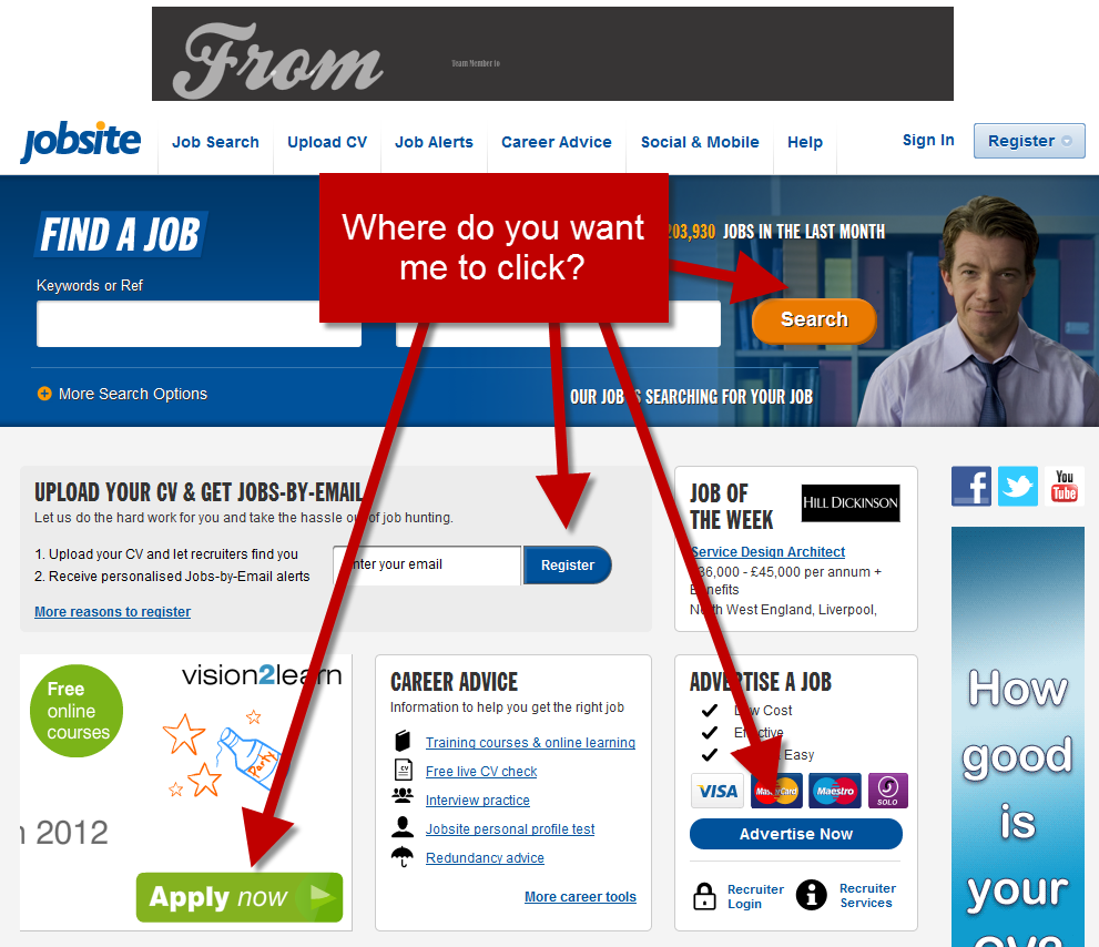
Usually, the next step after we have offered free information to people is to get them to sign up for the newsletter, make them buy the product/services, share their contact information, etc. Whatever our objective is, we need a ‘call for action’ button to make it happen.
On a crowded page, it can go unnoticed, and all the effort will be futile.
For this, we can have an A/B testing to evaluate which on gives us better results, and the variables can be on white space, the position of text/button, among other things.
As attention ratio should be 1:1 in an optimized campaign, that means only one place to click and lots of white space.
Look at these two examples of landing pages, which one do you understand better at a glance.

Designing a page should be done by keeping your audience in mind; it should be effortless for understanding and yet informative.
‘White space is not the absence of design but its integral component.’